Ten years of addons.mozilla.org
Ten years ago, Ben Smedberg and Wolf landed the first version of the code that would make up AMO. At the end of 2004 it was still called update.mozilla.org, written in PHP, and was just over 200k, compressed.
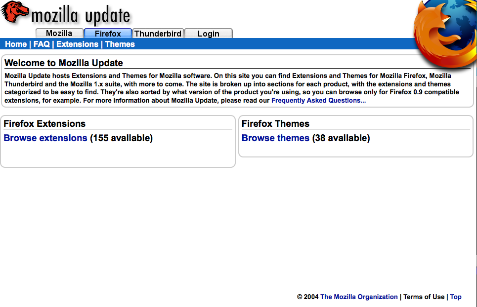 Behold the home page of update.mozilla.org.
This moved through, I think, 1 major revision “update-beta” which added a database tabled called main that held all the add-on info. This came with some additional fancy styles:
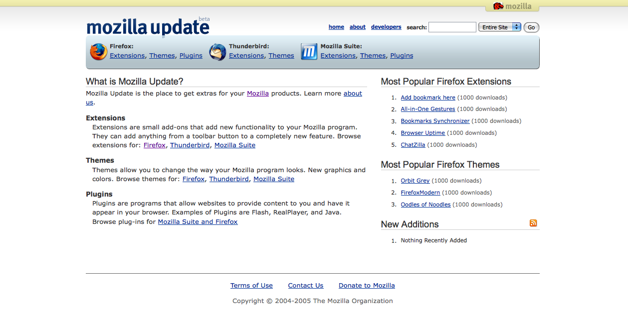 I started around 16 months after this foundation was laid. AMO was essentially
flat HTML files sprinkled with PHP code and database queries, just like
everyone says not to do now. I think the code was running on a single server
named Chameleon at the time and as we released versions of Firefox it
would get overwhelmed and become unresponsive. Most of the work at this time
was adding in layers of caching like Smarty and keeping everything in
memcached. We had a major rewrite in planning (one with more dynamic
possibilities) and I chose CakePHP as the
foundation. That release happened and brought another redesign with it:
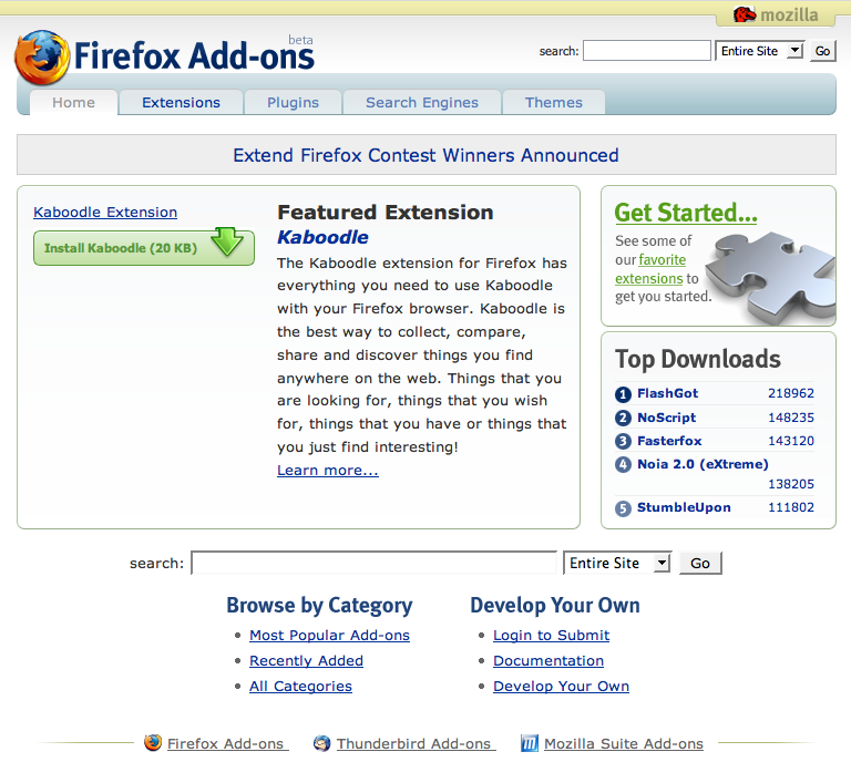 Check out how those gorgeous pale yellow and faded blue bars complement each
other. Also note that we’re still claiming to be in beta at this point.
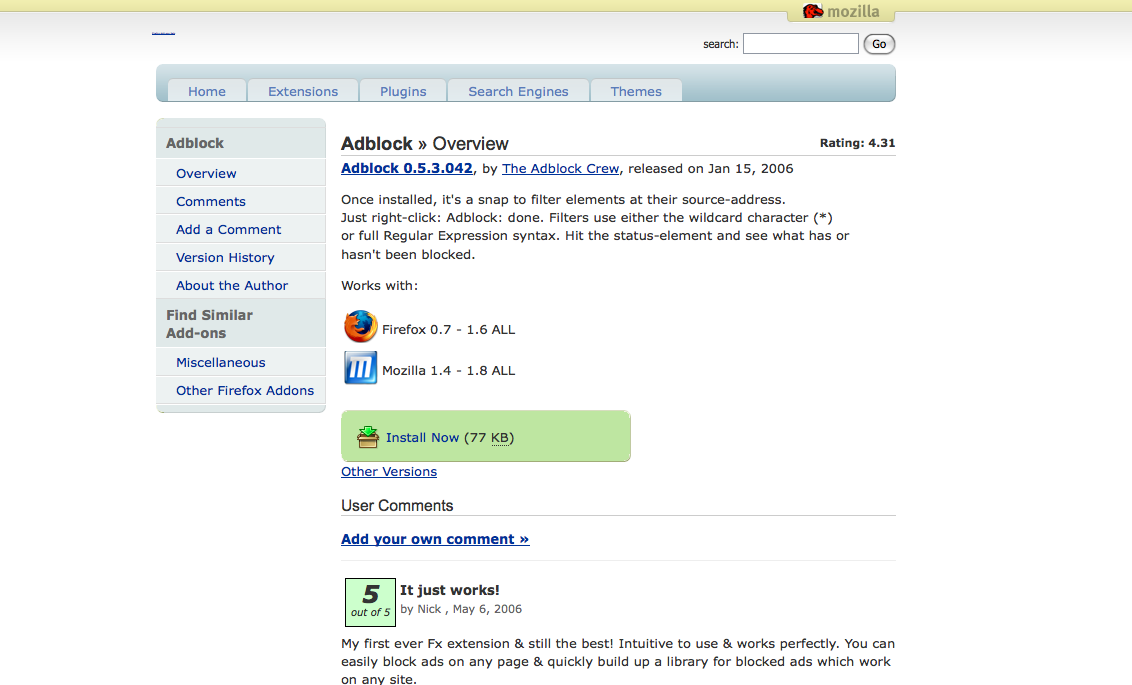 The Adblock detail page in 2006. Rated 5 out of 5 by someone named Nick!
Finally, at the end of 2006 the infamous chopper design appeared and took over
the top third of our site:
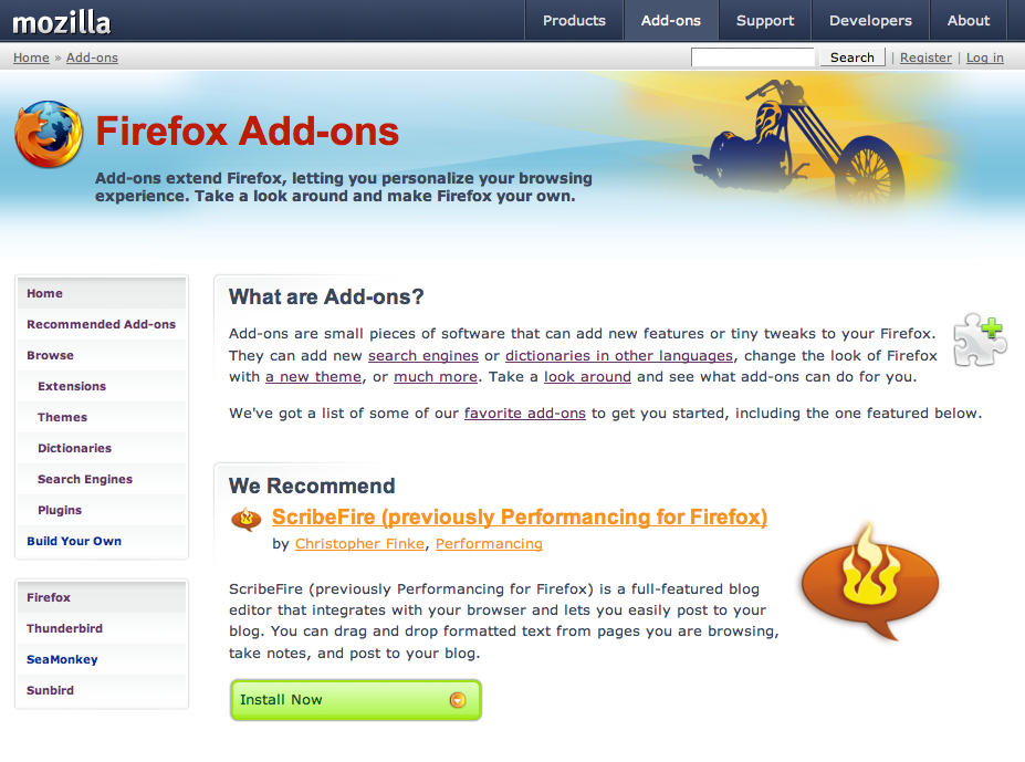 Customizability was the message we were trying to communicate with
this design. There were some concerns voiced at the time…
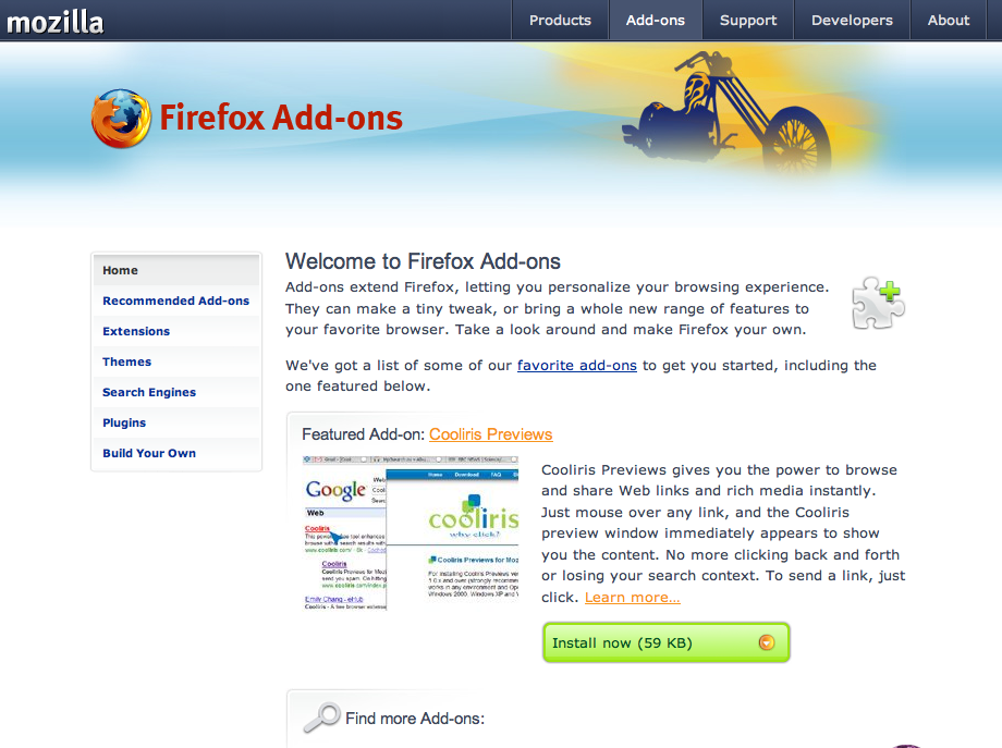 This version followed the first quickly. The header was reduced slightly, the
content got some more margin, and we started using whitespace to keep things
looking simple. On the other hand, you’ll notice our buttons getting more
complicated - this was the beginning of our button horrors as we started to
customize them for each visitor’s device.
Both chopper designs were relatively short lived and, I want to say around early 2008 we moved to another infamous design - the green candy bar.
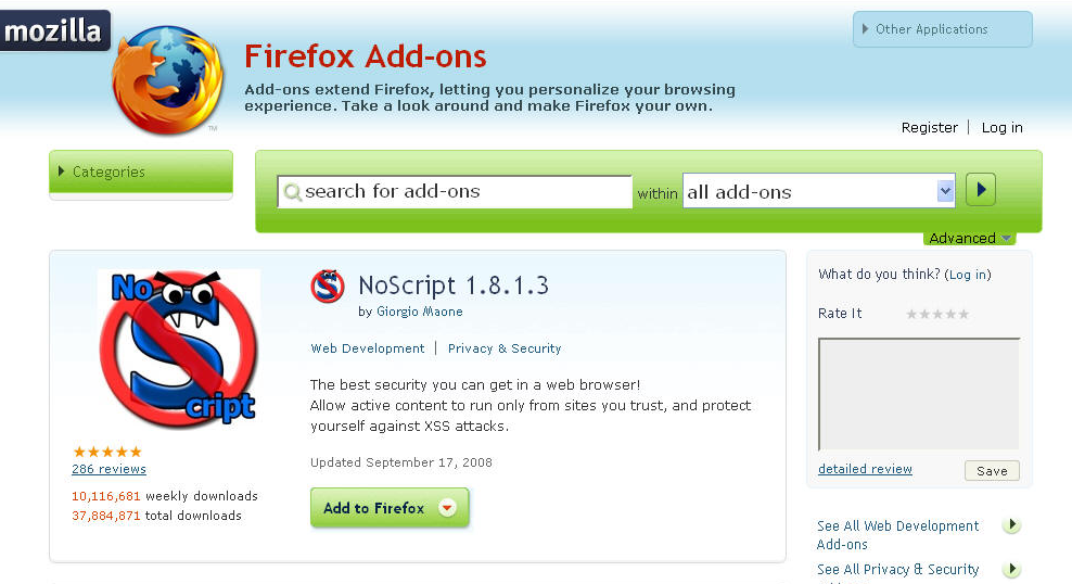 Here we are emphasizing search. And how. There was a rumor we actually stole
this design from another site at the time - I assure you that wasn’t the case.
I don’t remember the actual date on this one, but let’s say 2009 since we seem to redesign this every year. This was a complete departure from our previous work and the design was done from scratch.
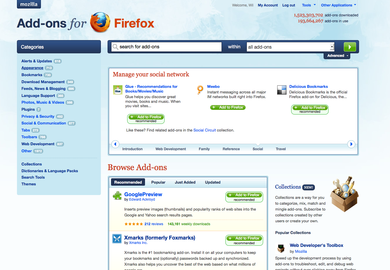 Not a bad looking design and one that served us well.
Finally, our current design:
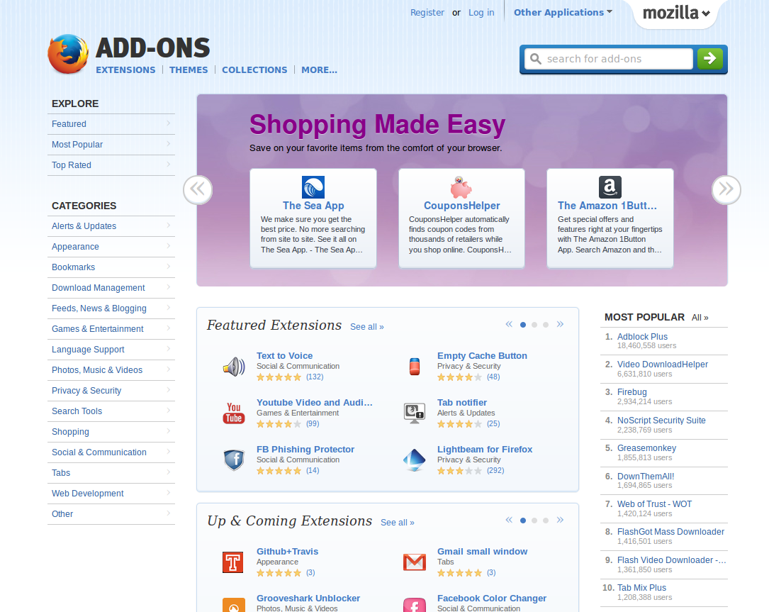
I still think this is a good looking site.
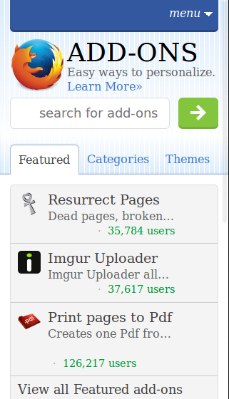
This design was also the first year we had a separate mobile site.
I’ve had the draft for this post written for years and I think it’s time just to hit publish on it - feel free to comment about all the things I forgot. There should probably also be some disclaimer about me writing this on a Friday afternoon and I take no responsibility for misinformation or wrong dates. :)
Thanks to fligtar for having screenshots of all the old versions!