Marketplace and Payments Systems Diagrams
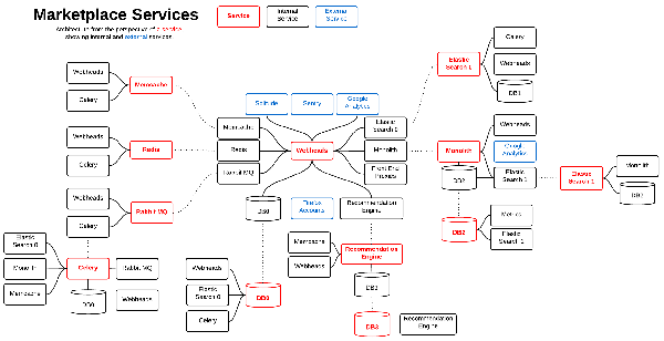
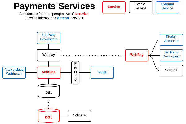
A couple years ago Krupa filled up a whiteboard with boxes and arrows, diagramming what the AMO systems looked like. There was recently interest in reviving that diagram and seeing what the Marketplace systems would look like in the same style so I sat down and drew the diagrams below, one for the Marketplace and one for Payments.
Marketplace:
Payments:
Honestly, I appreciate the view, but I wince at first glance because of all the duplication. It’s supposed to be “services from the perspective of a single service.” Meaning, if the box is red, anything connected to it is what that box talks to. Since the webheads talk to nearly everything it made sense to put them in the middle, and the dotted lines simply connect duplicate services. I’m unsure whether that’s intuitive though, or if it would be easier to understand if I simply had a single node for each service and drew lines all over the diagram. I might try that next time, unless someone gives me a different idea. :)
Lastly, this is the diagram that came out first when I was trying to draw the two above. It breaks the Marketplace down into layers which I like because we emphasize being API driven frequently, but I’m not sure the significant vertical alignment is clear unless you’re already familiar with the project. I think finding a way to use color here would be helpful - maybe as a background for each “column.”
Or maybe I’m being too hard on the diagrams. What would you change? Are there other areas you’d like to see drawn out or maybe this same area but through a different lens?


